
<iframe sandbox="allow-scripts" src="https://www.simplifyingthemarket.com/en/videos/embed/405191-bf9ce7799899cf839e0bf0e261497d3e/59deec78" frameborder="0" allowfullscreen width="560" height="315"></iframe>
5 Simple Graphs That Prove This Is Not Like the Last Time
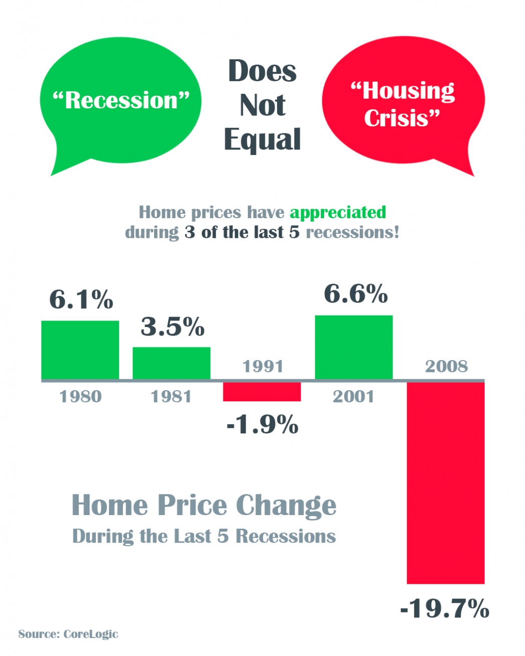
A Recession Does Not Equal a Housing Crisis
A Recession Does Not Equal a Housing Crisis Some HighlightsThe COVID-19 pandemic is causing an economic slowdown.The good news is, home values actually increased in 3 of the last 5 U.S. recessions and decreased by less than 2% in the 4th.All things considered, an...
Coronavirus Map
View the the interactive map https://google.org/crisisresponse/covid19-map